Article
Case Study: Capturing Quality Images for ML Algorithm
This post was previously on the Pathfinder Software site. Pathfinder Software changed its name to Orthogonal in 2016. Read more.
Clayton Miller is a user experience (UX) and visual designer at Orthogonal. His previous agency experience in the visual design world ranges from basic design work to UX design and development. Since joining Orthogonal, Miller has transitioned further into UX and visual design, incorporating UX into new product designs and development.
Creating a product with a positive UX is the key to success in any industry, but especially in the technology and healthcare spaces. The early stages of developing any product involve an intense research component, including a UX process. For example, for the development of a phlebotomy device, a UX team was tasked with synthesizing information about blood centers. The on-site research included interviewing people involved in all aspects of the phlebotomy process, including those who performed phlebotomies, those involved in the daily process of drawing blood from donors, and potential clients. Ultimately, everything observed in the field would influence the design and development of the new product, particularly in terms of how the user interface would work.
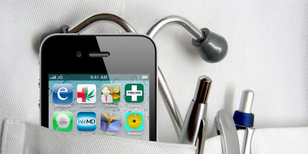
After initial UX research is completed and the UX team has begun to rough out the product’s screens as wireframes, Miller and his team begin working to translate the wireframes into a system of visual language and presentation patterns that support the goals of the product. In this case, the goal was to aid phlebotomists in performing their duties with maximum accuracy and minimum error.
Designing new products with a positive UX is a delicate balance of creating familiarity through iconography and user interface patterns, and improving functionality without reducing ease of use. This process can be difficult to master, but it is also quite interesting. Miller cites one project in which his team was tasked with creating a visual vocabulary for a tablet-based application.
“We looked at some of the customer’s existing products to identify a unifying set of visual principles,” says Miller. “What we were looking for was a set of visual elements that the existing user base would expect to see in other applications and other devices.”
Reusing and recycling icons and user interfaces are especially useful in a creating a more easily adaptable new product. For example, Miller notes that while many applications use a magnifying glass as an icon for the search function, the user base his team was working with was accustomed to a binoculars icon for the search function. With this in mind, the design team decided to use binoculars as the search icon in the visual vocabulary of the new app, which allowed for an easy user transition.
Product development and design, especially in the technology and healthcare fields, is an ongoing process of discovering the best processes and practices. By incorporating user feedback and UX, developers are able to continually improve products to meet the demands of the users.
Related Posts

Article
Case Study: Capturing Quality Images for ML Algorithm
Article
Roundup: Bluetooth Medical Devices Cleared by FDA in 2024

Article
Help Us Build an Authoritative List of SaMD Cleared by the FDA

Article
SaMD Cleared by the FDA: The Ultimate Running List