Article
Patient Engagement & UX for Bluetooth Medical Devices
This post was previously on the Pathfinder Software site. Pathfinder Software changed its name to Orthogonal in 2016. Read more.

Mobile apps need to be designed and tested to scale to avoid surprises when actual human hands start operating the app. Designs crafted or presented on large monitors can be deceiving, because it’s hard to think in terms of two scales at the same time. Better to work at scale, and if possible even view key screens and simple prototypes on the device itself.
Following are some simple techniques for designing and testing with scale prototypes.
Index Card Prototypes
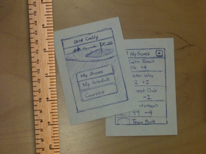
For a mobile smart phone app, a stack of 3×5 index cards will roughly approximate the size of the device. Screen concepts can be sketched on the cards and a walk through demo can quickly be assembled. While this kind of demo is rough, the time to create it is minimal and the resulting card stack can be used for informal usability tests.
When sketching a prototype, try several ways of organizing the content to keep the screens simple. Finding the right organizing approach should make the design of the supporting parts easier, so it pays to try as many ideas as you can think of to get an optimal one. Spend minutes, not hours, on your initial concepts.
To-Scale Storyboards
Another effective and simple prototyping technique is to make to-scale blank storyboard screens that represent the footprint of your device. Be sure you represent physical size correctly, so when you print the blank storyboard pages your screens are true to your device size. Storyboards are particularly useful for illustrating ideas of how an app can flow, or what a key usage scenario might look like.
On-device Sample Screens
Sample screen mock-ups and even sketches can often be best reviewed if you display them on the actual device. This doesn’t require a lot of code or even any code. Graphics images produced to-scale could be loaded onto the device in an application or prototyping program with minimal functionality that just displays the images.
On-Device Prototypes
The most reliable way to test a touch prototype is to get some actual functionality running on the target device. Of course, this is also the most expensive way to test but it can be worth the effort. This is especially true for testing the feel of the app, because the feel will depend on several things working together, including how the device is held (or positioned), the ease of seeing where things are at on the screen, the ease of locating interactive elements, the expected behavior of the app vs. the actual behavior and the responsiveness of the device to actual gestures.
To reach a compromise between the cost and value of such a test, it is usually best to focus on one or two key aspects of the feel and plan to do a few iterations of the test. The ability to re-iterate a test after doing some refinements can lead to much more valuable findings than a simple one-shot test.
Related Posts

Article
Patient Engagement & UX for Bluetooth Medical Devices

Article
How Design Can Improve Ratings for Medical Device Apps

Article
Bluetooth Trends in Smartphones: Effects on Medical Devices

Article
5 Keys to Integrating UX Design With Agile for SaMD